This week we will look at Android on-board databases by taking a look at SQLite and the Room Persistence API.
@Composable)A Room application with one database table would contain, as a minimum, these four classes:
 import androidx.room.Entity
import androidx.room.PrimaryKey

@Entity(tableName="students")

data class Student(
    @PrimaryKey(autoGenerate = true) val id: Long,
    val name: String,
    var course: String,
    var mark: Int
)
@ColumnInfo, e.g:
 import androidx.room.Entity
import androidx.room.PrimaryKey

@Entity(tableName="students")

data class Student(
    @PrimaryKey(autoGenerate = true) val id: Long = 0,
    @ColumnInfo(name="the_name") val name: String,
    @ColumnInfo(name="the_course") var course: String, var mark: Int
)
In this example the columns used in the actual database will be the_name and the_course.import androidx.room.*
@Dao
interface StudentDao {
@Query("SELECT * FROM students WHERE id=:id")
fun getStudentById(id: Long): Student?
@Query("SELECT * FROM students")
fun getAllStudents(): List<Student>
@Insert
fun insert(student: Student) : Long
@Update
fun update(student: Student) : Int
@Delete
fun delete(student: Student) : Int
}
import android.content.Context
import androidx.room.Database
import androidx.room.Room
import androidx.room.RoomDatabase

@Database(entities = arrayOf(Student::class), version = 1, exportSchema = false)
public abstract class StudentDatabase: RoomDatabase() {
    abstract fun studentDao(): StudentDao

    companion object {
        private var instance: StudentDatabase? = null

        fun getDatabase(ctx:Context) : StudentDatabase {
            var tmpInstance = instance
            if(tmpInstance == null) {
                tmpInstance = Room.databaseBuilder(
                    ctx.applicationContext,
                    StudentDatabase::class.java,
                    "studentDatabase"
                ).build()
                instance = tmpInstance
            }
            return tmpInstance
        }
    }
}
Last week we looked at coroutines. One thing we did not examine though was the concept of coroutine context. Each coroutine runs in a context which determines whether the coroutine runs in the foreground or background.
Dispatchers.Main - always runs in the foreground in
Android; code which needs to interact with the GUI would go in here. This is the default context.Dispatchers.IO - a background context optimised for
input/output operations, for example network communication.Dispatchers.Default - a background context optimised for
heavy calculations and processing which does not use input/output. Despite the name, in Android it is not the default context; Dispatchers.Main is.withContext() and specify a lambda or suspend function which runs in the new context (typically a background context such as Dispatchers.IO). While it is running, the original coroutine suspends until the code in the new context has completed.
lifecycleScope.launch {
    // Code runs in the Dispatchers.Main context

    withContext(Dispatchers.IO) {
        // Code runs in the Dispatchers.IO context
    }

    // Code here runs once the withContext() block completes
}
This is a basic and incomplete example showing how to set up the activity to load the database. It also shows how to query a Room database inside withContext().
// Other imports left out...

import kotlinx.coroutines.Dispatchers
import kotlinx.coroutines.launch
import kotlinx.coroutines.withContext

class MainActivity: ComponentActivity() {
    lateinit var db: StudentDatabase

    override fun onCreate(savedInstanceState: Bundle?) {
        super.onCreate(savedInstanceState)
        db = StudentDatabase.getDatabase(application)

        setContent {
            Button(onClick = {
                // If in a ViewModel, use viewModelScope (see last week)
                lifecycleScope.launch {
                    withContext(Dispatchers.IO) {
                        // Room code should go here
                        // Create an example Student and add it to the database
                        val s = Student(name="Alex Smith", course="SE", mark=77)
                        db.studentDao().add(s)
                    }
                    // UI code should go outside the "withContext()" block
                }
            }
            }) {
                Text("Add Student")
            }
        }
    }
}
Room works particularly well with a ViewModel and LiveData.
It's easy to update a DAO to return LiveData.We simply update our DAO so that the search methods return LiveData of the appropriate type. So, in a student records app, we might change:
@Query("SELECT * FROM students")
fun getAllStudents(): List<Student>
to:
@Query("SELECT * FROM students")
fun getAllStudents(): LiveData<List<Student>>
This allows other parts of your code to observe changes in the database and auto-update as the database updates.
The other thing we can do is to use both LiveData and a ViewModel together with Room. To do this you would return LiveData from the DAO (as above) and store a reference to it in your ViewModel. Then, you can observe the data in the ViewModel with an Observer, as before.
Here is an example of a ViewModel set up to store LiveData from a Room database containing student records:
package com.example.roomapp

import android.app.Application
import androidx.lifecycle.AndroidViewModel
import androidx.lifecycle.LiveData

// We need to pass in the Application object
class StudentViewModel(app: Application): AndroidViewModel(app)  {
    // Get a reference to the database, using the Application object
    var db = StudentDatabase.getDatabase(app)
    var students : LiveData<List<Student>>

    // When we initialise the ViewModel, get the LiveData from the DAO
    // The variable 'students' will always contain the latest LiveData.
    init {
        students = db.studentDao().getAllStudents()
    }

    // Return the LiveData, so it can be observed, e.g. from the MainActivity
    fun getAllStudents(): LiveData<List<Student>> {
        return students
    }

    fun addStudent(name: String, course: String) {
        // add a student by launching a coroutine as above, but using viewModelScope instead of lifecycleScope
    }
}
The ViewModel would then be setup from the MainActivity in the normal way:
val viewModel : StudentViewModel by viewModels()and observed in the normal way by observing the
getAllStudents() method of the ViewModel:
viewModel.getAllStudents().observe(this) {
    stateResults = it // store data in 'stateResults', a SnapshotStateList state variable (i.e. initialised with mutableStateListOf() )
}
As shown by the addStudent() method in the ViewModel above, we could also add methods to the ViewModel to perform database operations by launching a coroutine in viewModelScope, rather than lifecycleScope. By doing so, our code would be protected against being terminated early if the device is rotated.
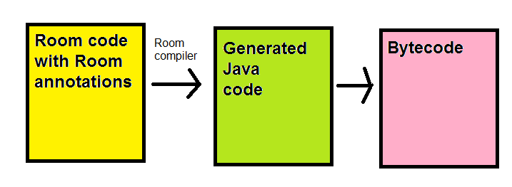
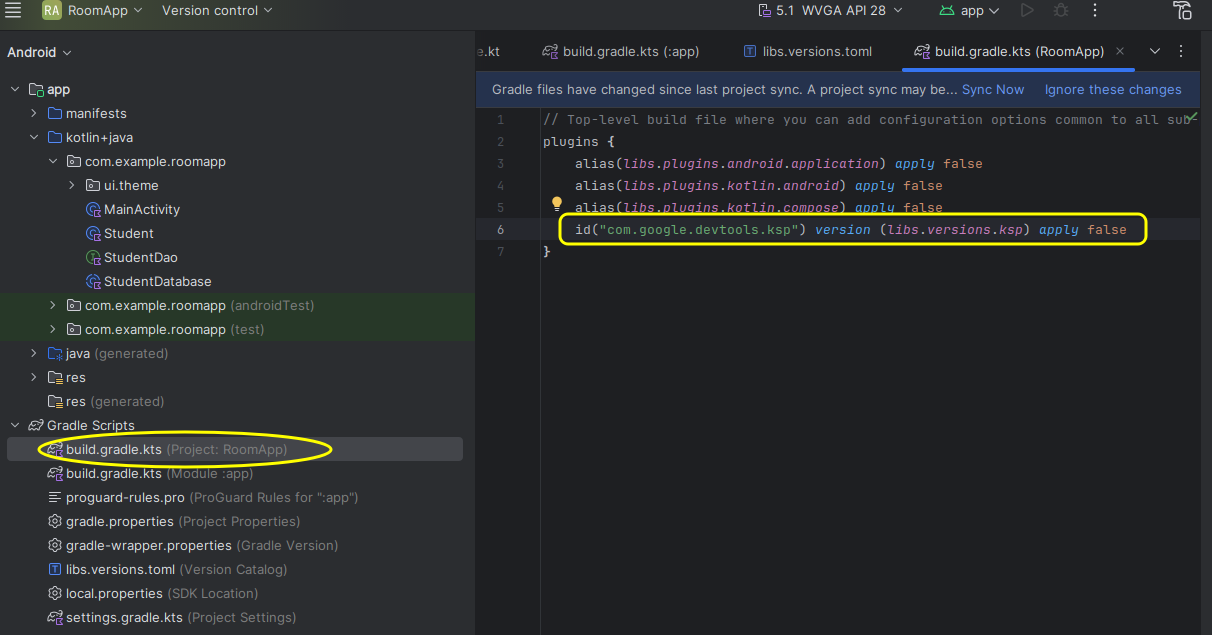
You need to add the Room dependencies to your project. This is a little more involved than normal as you have to include the Room Compiler, which processes the Room annotations and converts them into regular code. This involves a tool known as KSP.
First setup your version catalog (libs.versions.toml) as shown below. Note the highlighted sections: these are the Room dependencies.
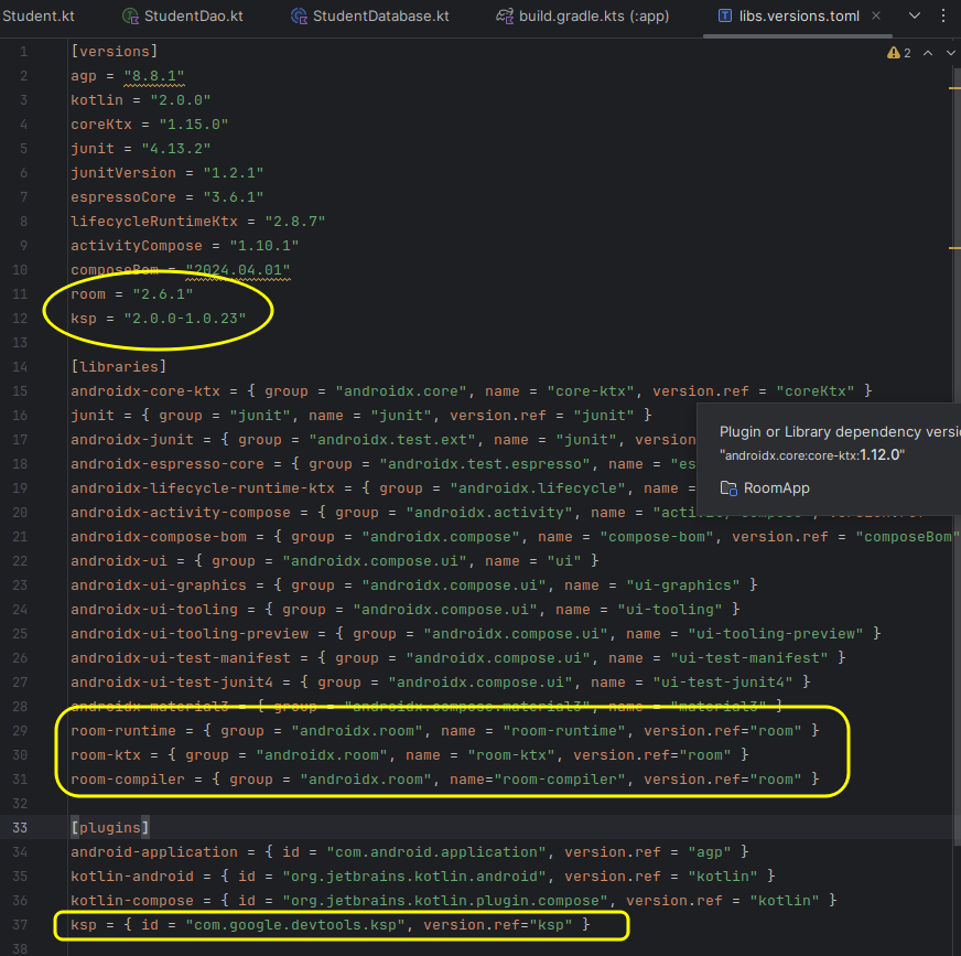
These include the Room version, the KSP version (see below), the Room libraries needed, and the KSP plugin (see below) in the [plugins] section.
Note the entry in the plugins section. What is this? KSP (Kotlin Symbol Processing) is a tool which will process Java-based annotations in Kotlin code, such as the annotations used by Room. See the documentation.
To set up KSP you need to add it to choose an appropriate version.
Note the version in the example above 2.0.0-1.0.23, this is specific to my system. The exact version you need to choose depends on the version of the Kotlin compiler on your system. The first number is the Kotlin compiler version and the second number is the KSP version. You need to choose a version which corresponds to your Kotlin compiler version (2.0.0 in this example). To find out the Kotlin version, go to File-Settings-Other Settings-Kotlin Compiler in Android Studio.
Then lookup the KSP versions at the GitHub repository and choose the most recent version which is compatible with your version of Kotlin.
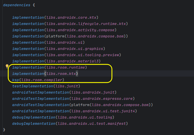
Having added Room and KSP to your version catalog, you need to then specify the dependencies in your app build.gradle.kts. There are two things you need to do, specify the regular libraries and then specify the KSP plugin. First, the regular libraries:
Then you need to specify the KSP plugin, within the plugins section of your app build.gradle.kts (at the top):
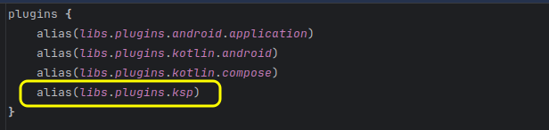
You also need to modify the project build.gradle.kts (the first of the two) to add a reference to the KSP plugin:
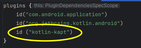
For a currently-unknown reason, KSP was (one year ago - the issue has possibly been fixed) not compatible with some configurations of Android Studio. If you obtain obscure errors when using KSP (ensuring you follow the instructions carefully), please use the older KAPT tool instead. To use KAPT instead of KSP:
plugins in the build.gradle.kts;plugins in the App build.gradle.kts with:
id("kotlin-kapt")
as shown below:
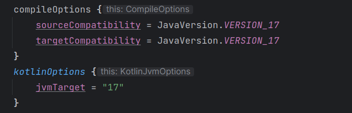
compileOptions and kotlinOptions from 1.8 to 17 in the app build.gradle.kts, as shown below:
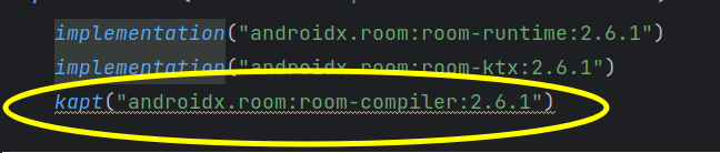
kapt instead of ksp (note, this screenshot was from an older version of Android Studio which added dependencies directly in the build.gradle.kts rather than the version catalog):
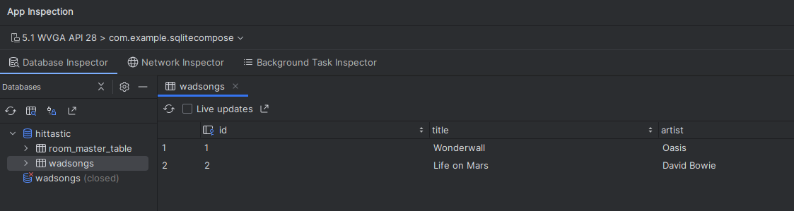
You can view your database from Android Studio by selecting View-Tool Windows-App Inspection. You have to use a device running at least API 26 to do this. Here is an example:
Develop an application to store music in an SQLite database using Room. Use a device running at least API level 26 so you can use the Database Inspector to visualise your database.
The Activity should have a layout with four fields: ID, Title, Artist and Year, with four buttons (Search by ID, Add, Update, Delete). These buttons should have the following effects. Each should call an appropriate method in your DAO. These buttons should perform the following operations:
also() method useful here:
foundSong?.apply {
    // process the song if it was found
}.also {
    if(it == null) {
        // handle no song found
    }
}
The use of also() allows you to do further processing on a given object after we've performed one action (handling the found song if it exists, in this example). It allows you to chain a series of lambda functions to be performed on an object.
Rewrite your code to use a ViewModel and LiveData, making a list of all songs in the database available as LiveData. Run the "add song" database operation from a coroutine launched in viewModelScope, within a method of your ViewModel. Also, observe the LiveData from your composable hierarchy and display a list of all songs added so far, using a LazyColumn.
Save data in a local database using Room - Android documentation on Room.