As you have seen in previous sessions, Jetpack Compose is recommended as the contemporary standard in UI development. However you may still be exposed to the older approach to developing UIs using XML layouts and Views, so we will look at it here. In particular, you may find yourself working with other people's code, or third-party libraries, which uses this approach. Due to its use of Views (to be discussed below), this approach is know as the Views approach to UI development.
The View is the single most important concept in Views UI development. A View represents a visible component on the screen, such as a button, a text field or a label. View is an Android API class and all Views UI components are sub-classes of View, for example a Views Button (different to the Compose Button) is a subclass of View.
Every Views Activity contains a View which is the "main component" of the screen, referred to as the content view. This is normally, but not always, a parent View which contains a series of other Views. In the example below, it's the simplest type of View: a TextView. A TextView is what it sounds like: a View which can contain text. So here, we create a TextView containing the text "Hello world" and make it the content view of our Activity.
package com.example.myapp
import androidx.appcompat.app.AppCompatActivity
import android.os.Bundle
import android.widget.TextView

class MainActivity : AppCompatActivity() {

    override fun onCreate(savedInstanceState: Bundle?) {
        super.onCreate(savedInstanceState)
        val tv = TextView(this)
        tv.setText("Hello World!")
        setContentView(tv)
    }
}
In Views development, we frequently we add components to the main screen programatically, as seen above. However we can cut down on the amount of setup code using XML layouts instead. With XML layouts, we define the layout of the content view of the Activity using XML tags. XML (eXtensible Markup Language) is a tag-based format for representing data, related to HTML.
Here is an example of an XML based layout:
<LinearLayout xmlns:android="http://schemas.android.com/apk/res/android"
    android:orientation="vertical"
    android:layout_width="match_parent"
    android:layout_height="match_parent">
<TextView android:layout_width="wrap_content"
android:layout_height="wrap_content" android:text="@string/hello" />
</LinearLayout>
LinearLayout defines the view's layout. The layout specifies how the various components are arranged with respect to each other. LinearLayout indicated that components are placed adjacent to each other, either vertically or horizontally (depending on the android:orientation attribute)android:layout_width and android:layout_height attributes of the TextView describe how it fills its parent layout in the horizontal and vertical directions. The most common values are match_parent and wrap_content. The former, as used here, means that the TextView entirely fills its parent (the LinearLayout), the result being that the TextView fills the entire screen. The latter,wrap_content, means that enough space to contain the content (the text "Hello World" here) should be used. android:text attribute specifies the text within the TextView. Note however how we don't give it a straight value, we use @string/hello, which will represent an entry with a name of hello in the strings.xml file.
layout resources folder. If you create a Views Activity when choosing the project type in Android Studio, it will create a layout file, activity_main.xml, for you.
As for other types of resource you access this through the auto-generated R class. So assuming the XML layout is in activity_main.xml, you can set the XML layout as the main content view of your activity with:
setContentView(R.layout.activity_main)The complete code would be as follows:
package com.example.myapp
import androidx.appcompat.app.AppCompatActivity
import android.os.Bundle

class MainActivity : AppCompatActivity() {

    override fun onCreate(savedInstanceState: Bundle?) {
        super.onCreate(savedInstanceState)
        setContentView(R.layout.activity_main)
    }
}
Here is an example of how events are handled in Views activities. It's the feet-to-metres exercise, but re-written for Views. Firstly, the XML layout:
<LinearLayout xmlns:android="http://schemas.android.com/apk/res/android"
    android:orientation="vertical"
    android:layout_width="match_parent"
    android:layout_height="match_parent">

 <EditText
    android:layout_width="match_parent"
    android:layout_height="wrap_content"
    android:inputType="numberDecimal"
    android:id="@+id/et1" />

 <Button
    android:layout_width="wrap_content"
    android:layout_height="wrap_content"
    android:id="@+id/btn1"
    android:text="@string/convertBtn" />

 <TextView
    android:layout_width="match_parent"
    android:layout_height="wrap_content"
    android:id="@+id/tv1"/>

</LinearLayout>
Note how this linear layout consists of an EditText (equivalent to a TextField in Compose), a Button and a TextView. Because the orientation of the LinearLayout is vertical, the elements will be stacked on top of each other (like a Column in Compose).
Note also how each element has an ID. This allows us to access it from within Kotlin, rather like how we can access HTML elements from JavaScript using their ID.
Here is the Kotlin code to interact with the elements in the layout. When the Button is pressed, it reads the feet from the EditText as a string, converts it to a double, converts it to metres and place the metres in the TextView.
import androidx.appcompat.app.AppCompatActivity
import android.os.Bundle
import android.widget.Button
import android.view.View.OnClickListener
import android.view.View
import android.widget.TextView
import android.widget.EditText

class MainActivity : AppCompatActivity () {
    override fun onCreate(savedInstanceState: Bundle?) {
        super.onCreate(savedInstanceState)
        setContentView(R.layout.activity_main)
        val b = findViewById<Button>(R.id.btn1)
        b.setOnClickListener {
            val et1 = findViewById<EditText>(R.id.et1)
            val feet = et1.text.toString().toDouble()
            val metres = feet*0.305
            val tv1 = findViewById<TextView>(R.id.tv1)
            tv1.text = "In metres that is: $metres"
        }
    }
}
First of all note how we access the user interface components from Kotlin. We use code such as:
val b = findViewById<Button>(R.id.btn1)Note how the
findViewById() method takes in an ID and returns the corresponding component. The ID matches the IDs that we specified in the XML file; for instance, our button was given an ID of btn1 so we reference it in code with R.id.btn1.
To handle events such as button clicks, we specify an event listener function, which is typically a lambda. For a button, the event listener is specified with setOnClickListener():
b.setOnClickListener {
    val et1 = findViewById<EditText>(R.id.et1)
    val feet = et1.text.toString().toDouble()
    val metres = feet*0.305
    val tv1 = findViewById<TextView>(R.id.tv1)
    tv1.text = "In metres that is: $metres"
}
When the button is clicked, the specified lambda function will run, and
as you can see, the lambda first obtains the edit text
element, and then reads the feet from it with
val feet = et1.text.toString().toDouble()Note that the
.text property of the edit text returns an object of type Editable. We then need to call toString() on the Editable to get the actual text out of the text field, and finally convert it to a Double using toDouble().
Then we convert the feet to metres and place the result in the TextView.
Before looking at mapping, we are going to explore how to add third-party dependencies to our app.
Android projects use the build tool Gradle to build an executable Android app from your source code and resources. You have met Gradle briefly in OODD. Gradle uses a build file build.gradle.kts to tell it how to build the project. We are now going to take a first look at the app's build.gradle.kts file and examine how to include third-party dependencies (i.e. libraries).
If you look at your build.gradle.kts (the one in your app folder, not the other one) you will see it contains a dependencies section looking something like this:
dependencies {

    implementation(libs.androidx.core.ktx)
    implementation(libs.androidx.lifecycle.runtime.ktx)
    implementation(libs.androidx.activity.compose)
    implementation(platform(libs.androidx.compose.bom))
    implementation(libs.androidx.ui)
    implementation(libs.androidx.ui.graphics)
    implementation(libs.androidx.ui.tooling.preview)
    implementation(libs.androidx.material3)
    implementation(libs.ramanimaps)
    testImplementation(libs.junit)
    androidTestImplementation(libs.androidx.junit)
    androidTestImplementation(libs.androidx.espresso.core)
    androidTestImplementation(platform(libs.androidx.compose.bom))
    androidTestImplementation(libs.androidx.ui.test.junit4)
    debugImplementation(libs.androidx.ui.tooling)
    debugImplementation(libs.androidx.ui.test.manifest)
}
The implementation lines are specific dependencies, for example libs.androidx.activity.compose for Compose. Where are these library names defined? They are defined in another file, the version catalog. This has the filename libs.versions.toml and it defines the exact versions of dependencies. Here is an example of a version catalog:
[versions]
agp = "8.4.2"
kotlin = "2.1.0"
coreKtx = "1.15.0"
junit = "4.13.2"
junitVersion = "1.2.1"
espressoCore = "3.6.1"
lifecycleRuntimeKtx = "2.8.7"
activityCompose = "1.10.0"
composeBom = "2023.08.00"

[libraries]
androidx-core-ktx = { group = "androidx.core", name = "core-ktx", version.ref = "coreKtx" }
junit = { group = "junit", name = "junit", version.ref = "junit" }
androidx-junit = { group = "androidx.test.ext", name = "junit", version.ref = "junitVersion" }
androidx-espresso-core = { group = "androidx.test.espresso", name = "espresso-core", version.ref = "espressoCore" }
androidx-lifecycle-runtime-ktx = { group = "androidx.lifecycle", name = "lifecycle-runtime-ktx", version.ref = "lifecycleRuntimeKtx" }
androidx-activity-compose = { group = "androidx.activity", name = "activity-compose", version.ref = "activityCompose" }
androidx-compose-bom = { group = "androidx.compose", name = "compose-bom", version.ref = "composeBom" }
androidx-ui = { group = "androidx.compose.ui", name = "ui" }
androidx-ui-graphics = { group = "androidx.compose.ui", name = "ui-graphics" }
androidx-ui-tooling = { group = "androidx.compose.ui", name = "ui-tooling" }
androidx-ui-tooling-preview = { group = "androidx.compose.ui", name = "ui-tooling-preview" }
androidx-ui-test-manifest = { group = "androidx.compose.ui", name = "ui-test-manifest" }
androidx-ui-test-junit4 = { group = "androidx.compose.ui", name = "ui-test-junit4" }
androidx-material3 = { group = "androidx.compose.material3", name = "material3" }
ramanimaps = { group = "org.ramani-maps", name = "ramani-maplibre", version = "0.8.3" }

[plugins]
android-application = { id = "com.android.application", version.ref = "agp" }
jetbrains-kotlin-android = { id = "org.jetbrains.kotlin.android", version.ref = "kotlin" }
compose-compiler = { id = "org.jetbrains.kotlin.plugin.compose", version.ref = "kotlin" }
This contains a [versions] section at the top, defining exact versions of various libraries.
This is followed by a [libraries] section, containing a series of definitions for each library. Note the relationship between this and the dependencies in the build.gradle.kts. The dots in the dependencies in build.gradle.kts correspond to dashes in the [libraries] section of the version catalog. So, for example, the libs.androidx.core.ktx line from the dependencies in the Gradle build file corresponds to the androidx-core-ktx line in the catalog.
Each library definition in the [libraries] section sepcifies three items of data which uniquely identify a specific version of a specific library: the group, the name and the version:
group is the group of libraries that this library belongs to, for example androidx.core for core Jetpack libraries. For third-party libraries, the group is often unique to the organisation providing the library, e.g. their domain name in reverse, e.g. com.example.superwidgets for the SuperWidgets organisation with the domain superwidgets.example.com.name is the name for this particular library.version is the version we want to use. We can either use version for a specific version, or version.ref for a version reference. If the latter is used, the version will be looked up from the [versions] section of the catalog.To use mapping, we need to include a third-party mapping library, specifically MapLibre Native. (see here).
Most location-based apps include a map as the content view of their main activity. Android comes with inbuilt map functionality via Google Maps; however to use Google Maps you need to obtain an API key and it comes with some restrictions so we are going to use an alternative mapping library: MapLibre Native, available here. (A library is a collection of classes with related functionality, such as mapping).
MapLibre Native is a third-party open source library which uses maps from any source, but commonly from the OpenStreetMap project. OpenStreetMap is a global project to provide free and open mapping data which anyone can contribute to; see the website for more details. OpenStreetMap provides the mapping data, but other projects provide the rendered (drawn) maps. One such project, which has appeared very recently and allows clients to download maps without any usage restrictions is OpenFreeMap. We will be using this.
Add it to the [libraries] section of your version catalog:
maplibre = { group = "org.maplibre.gl", name = "android-sdk", version.ref = "maplibre"}
and the specific version in the [versions] section:
maplibre = 11.5.1
and finally the dependency in the build.gradle.kts:
implementation(libs.maplibre)
Where is the MapLibre Native library coming from? It
downloads the MapLibre Native library from an online repository of Java/Kotlin
libraries. There are two repositories used: Google's own, and Maven Central, the standard one Maven also uses. Additional repositories can be specified in the settings.gradle.kts file.
Once the dependency has been downloaded, it will be saved on your computer so that it will not need to be downloaded next time you open the project.
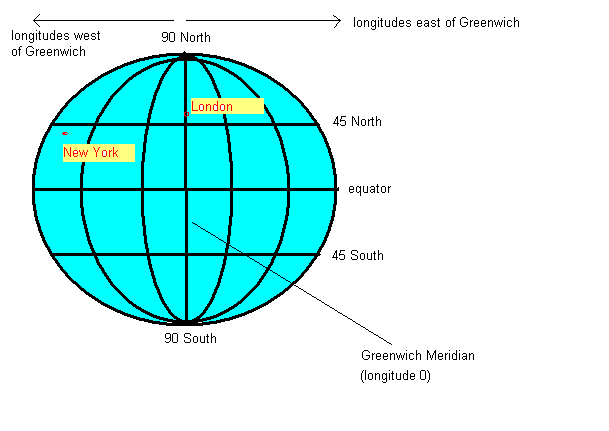
In order to understand location-based applications, it is important to understand the coordinate system used on the earth. The most common coordinate system uses latitude and longitude. Latitude is a measure of how far north or south you are: the equator is at 0 degrees, while the North Pole is at 90 degrees North, we are at about 50 and Spain is at about 40. Longitude is a measure of how far east or west you are: 0 degrees of longitude is referred to as the Prime Meridian (or Greenwich Meridian) and passes through Greenwich, London. By contrast Germany is located between approximately 7 degrees and 15 degrees East, while New York is at 74 degrees West and the west coast of North America at approximately 120 degrees West.
So a given point on the earth can be defined via its latitude and longitude. The university is at approximately, 50.9 North (latitude) and 1.4 West (longitude). By convention, latitudes north of the equator and longitudes east of Greenwich are treated as positive, so we can also define our position as longitude -1.4, latitude +50.9.
Here is a sample app using the MapLibre Native Android API using Views. It is based on the Android example.
ackage com.example.maplibre_views_1

import android.os.Bundle
import androidx.appcompat.app.AppCompatActivity
import org.maplibre.android.MapLibre
import org.maplibre.android.camera.CameraPosition
import org.maplibre.android.geometry.LatLng
import org.maplibre.android.maps.MapView

class MainActivity : AppCompatActivity() {
    // "lateinit" variables are variables which will be initialised later.
    // Here we cannot initialise the map immediately, only inside onCreate()
    // when the activity is setup and ready to go.

    lateinit var mapView: MapView

    override fun onCreate(savedInstanceState: Bundle?) {
        super.onCreate(savedInstanceState)
        MapLibre.getInstance(this)
        setContentView(R.layout.activity_main)

        // Find the map view from the XML layout
        mapView = findViewById(R.id.mapView)


        // Load the map. This is an asynchronous operation: the specified
        // lambda runs when the map has been loaded.

        mapView.getMapAsync { map ->
            // Set the map style and tile source - here we are using OpenFreeMap
            map.setStyle("https://tiles.openfreemap.org/styles/bright")

            // Set the position (51.05, -0.72) and zoom level (14)
            map.cameraPosition = CameraPosition.Builder()
               .target(LatLng(51.05, -0.72))
               .zoom(14.0)
               .build()
        }

    }

    // These are Android lifecycle methods.
    // They handle stages in the activity lifecycle, such as hiding the
    // activity and showing it again, and terminating the activity.
    // We implement these to ensure the map behaves correctly when the
    // activity changes state.

    // onStart() and onResume() are called when the activity becomes visible
    // again, after being hidden (e.g. user answers a phone call or navigates
    // to another app)

    override fun onStart() {
        super.onStart()
        mapView.onStart()
    }

    override fun onResume() {
        super.onResume()
        mapView.onResume()
    }

    // onPause() and onStop() are called when the activity becomes hidden (e.g.
    // user answers a phone call or navigates to another app)

    override fun onPause() {
        super.onPause()
        mapView.onPause()
    }

    override fun onStop() {
        super.onStop()
        mapView.onStop()
    }

    // onDestroy() is called when the user quits the activity by pressing the
    // Back button, or the system terminates the app e.g. due to low memory.

    override fun onDestroy() {
        super.onDestroy()
        mapView.onDestroy()
    }
}
The comments should provide explanation of the code. Here is the matching XML layout:
<LinearLayout xmlns:android="http://schemas.android.com/apk/res/android"
    android:orientation="vertical"
    android:layout_width="match_parent"
    android:layout_height="match_parent">
   <org.maplibre.android.maps.MapView
        android:id="@+id/mapView"
        android:layout_width="match_parent"
        android:layout_height="match_parent" />
</LinearLayout>
Mapping apps need to obtain the map tiles from the internet. To do this, we need to add the internet permission. The manifest file is an XML file describing the app and its components (e.g. the activities making up the app), as well as the app permissions (see below). It is called AndroidManifest.xml and can be found in the manifests directory.
Apps need to be granted permissions to perform sensitive operations. Sensitive operations can include:
We will look at permissions in more detail in a future session. For now, we just need to add one permission to the manifest file:
<uses-permission android:name="android.permission.INTERNET" />
What do we do if we want to use Views-based APIs within a Compose layout? We make use of the AndroidView composable. This is a composable designed precisely for the purpose of including Views inside a Compose layout. When creating an AndroidView you should specify two parameters:
factory. This is a function which should create and return the View you wish to include in the Compose layout, such as a MapView.update function. This code is called whenever the composable is re-rendered, for example because state changes. In here you would set any properties of the View that might need to change.MapComposable which is a composable wrapping a MapView:
@Composable
fun MapComposable(latLng: LatLng) {
        AndroidView(
            factory = { ctx ->
                val mapView = MapView(ctx)
                mapView.getMapAsync { map ->
                    map.setStyle("https://tiles.openfreemap.org/styles/bright")

                    map.cameraPosition = CameraPosition.Builder()
                        .target(latLng).zoom(14.0).build()

                }
                mapView
            },
            update = {
                // handle changes to latLng (e.g. from a GPS) (not shown)
            }
        )
}
Note how the MapComposable contains an AndroidView. To explore the AndroidView in more detail:
factory, a lambda, is run when the layout is first created. It takes one parameter ctx. This is a Context, a standard Android class which represents primary application components such as Activities. Here, the context ctx will represent the activity, but it can represent other components in some situations. The context is typically needed for creating the View: note how we pass it into the MapView in this case.MapView is the final statement in the lambda, so the MapView will be returned from the factory in this case. This is what we must do: we must return the View from the factory function.update parameter. This is also a function: this function runs each time a composable is re-rendered, for example the state changes. In here, you make changes to the underlying View which may need to be made if the state changes. The update function takes the View that we returned from the factory as a parameter (view in the example), so here the parameter will represent the MapView. In this example,
we could implement code to change position of the map when the latLng parameter to the AndroidView changes.We have seen how, in theory, we can integrate a Views-based library into Compose. However, having to use AndroidView all the time can be cumbersome and we also have to take into account such things as handling the different lifecycle stages, such as onPause(), onResume(),
onDestroy() and so on. It would be nice to be able to use a "pure-Compose" approach to Android mapping and luckily we can. There are a few libraries out there which provide a pre-written Compose wrapper round MapLibre Native and one such library is Ramani Maps. Ramani Maps provides an easy-to-use Compose interface to MapLibre Native allowing you to write your map as a composable, and control properties such as the latitude, longitude and zoom level - as well as add shapes such as lines, polygons and circles to the map as markers. You can find out more about Ramani Maps in this video of the developer's presentation at the 2023 State of the Map Europe conference.
Here is a simple Hello World app using Ramani Maps.
package com.example.ramani_test

import android.os.Bundle
import androidx.activity.ComponentActivity
import androidx.activity.compose.setContent
import androidx.compose.foundation.layout.fillMaxSize
import androidx.compose.ui.Modifier
import com.example.ramani_test.ui.theme.RamaniAppTheme
import org.maplibre.android.geometry.LatLng
import org.maplibre.android.maps.Style
import org.ramani.compose.MapLibre
import org.ramani.compose.CameraPosition

class MainActivity : ComponentActivity() {
    override fun onCreate(savedInstanceState: Bundle?) {
        super.onCreate(savedInstanceState)
        setContent {
            RamaniAppTheme {
                MapLibre(
                    modifier=Modifier.fillMaxSize(),
                    styleBuilder= Style.Builder().fromUri("https://tiles.openfreemap.org/styles/bright"),
                    cameraPosition = CameraPosition(
                        target  = LatLng(51.05, -0.72),
                        zoom = 14.0
                    )
                )
            }
        }
    }
}
Note how we create a MapLibre composable to contain the map. We give it various properties, including a modifier, a styleBuilder and a cameraPosition. The styleBuilder allows us to define a map style, as we did for the standard MapLibre Native example. The cameraPosition allows us to define the position (target) and zoom level of the map.
[libraries] in the version catalog:
ramanimaps = { group="org.ramani-maps", name="ramani-maplibre", version.ref="ramanimaps" }
[versions] in the version catalog:
ramanimaps = "0.8.3"
dependencies section in your build.gradle.kts:
implementation(libs.ramanimaps)
We can easily add shapes to the map, such as circles, polygons and polylines. Here is an example:
class MainActivity : ComponentActivity() {
    override fun onCreate(savedInstanceState: Bundle?) {
        super.onCreate(savedInstanceState)
       // enableEdgeToEdge()
        setContent {
            RamanitestTheme {
                Column {
                    MapLibre(
                        modifier = Modifier.fillMaxSize(),
                        styleBuilder = Style.Builder()
                            .fromUri("https://tiles.openfreemap.org/styles/bright"),
                        cameraPosition = CameraPosition(
                            target = LatLng(51.05, -0.72),
                            zoom = 14.0
                        )
                    ) {

                        Circle(center = LatLng(51.05, -0.72),
                            radius = 100.0f,
                            opacity = 0.5f
                        )

                        Polyline(
                            points = listOf(
                                LatLng(51.05, -0.72),
                                LatLng(51.049, -0.723),
                            ),
                            color = "#0000ff",
                            lineWidth = 3.0f
                        )

                        Polygon(
                            vertices = listOf(
                                LatLng(51.047, -0.72),
                                LatLng(51.046, -0.723),
                                LatLng(51.045, -0.717)
                            ),
                            fillColor = "#ff0000",
                            opacity = 0.3f,
                            borderColor = "#ff0000"
                        )
                    }
                }
            }
        }
    }
}
Note how we add a Circle, a Polyline and a Polygon as child composables of the main MapLibre composable. We also give them properties, such as position (center for Circle, points for Polyline and vertices for Polygon), as well as color (colour names, e.g. "Red", or CSS-style RGB strings, e.g. "#ff0000"), opacity (0=fully transparent, 1=fully opaque), radius and lineWidth.
Hopefully you can appreciate that Ramani Maps allows you to code your maps in declarative, Compose style.
Before attempting these exercises, ensure that you complete Exercises 1 and 2 from last week. You do not, however, have to complete the advanced (messaging) exercise.
TextFields. Create a Compose layout with:
LatLng - part of MapLibre Native).LatLng should be updated appropriately.LatLng changes.zIndex specified in the Modifier and set to 2.0f. zIndex represents vertical height and ensures that the row will stack on top of the map; the map overflows the space allocated to their parent Composable and occupies the rest of the screen.
isDraggable and onDragFinished properties of a circle. The latter occurs when the user finishes dragging a shape, and takes a lambda which receives the new LatLng as a parameter. Make your circle draggable, and update the LatLng state variable to the position that the circle is dragged to.